This is a set of 3 Brochures that are bound with a bellyband for tourists attractions in Chicago.
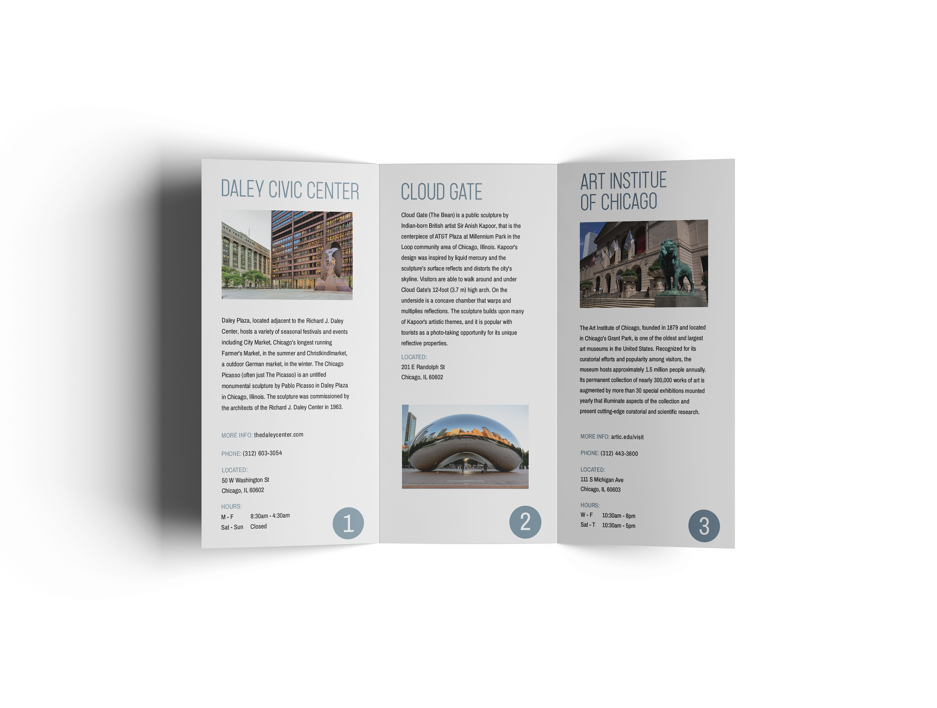
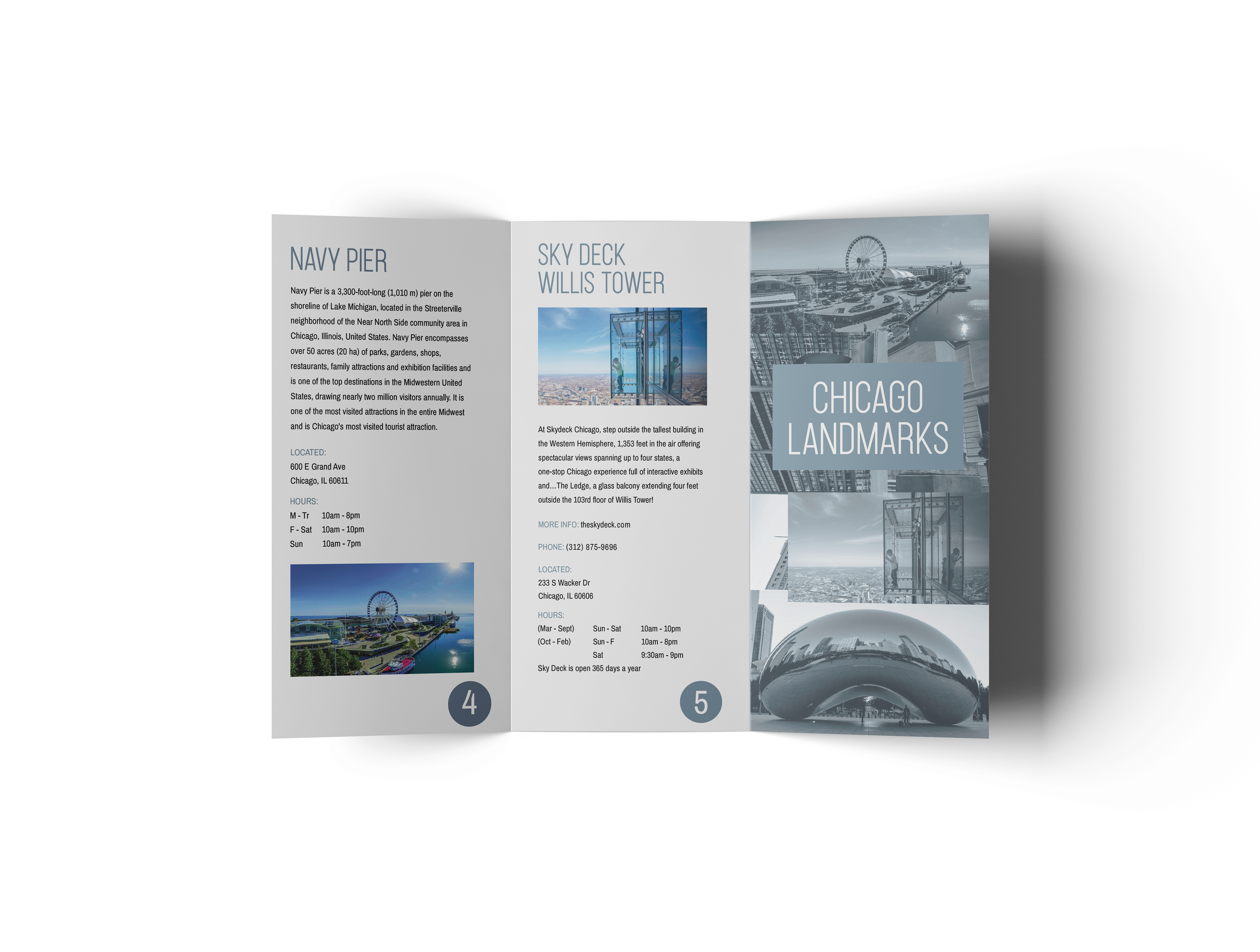
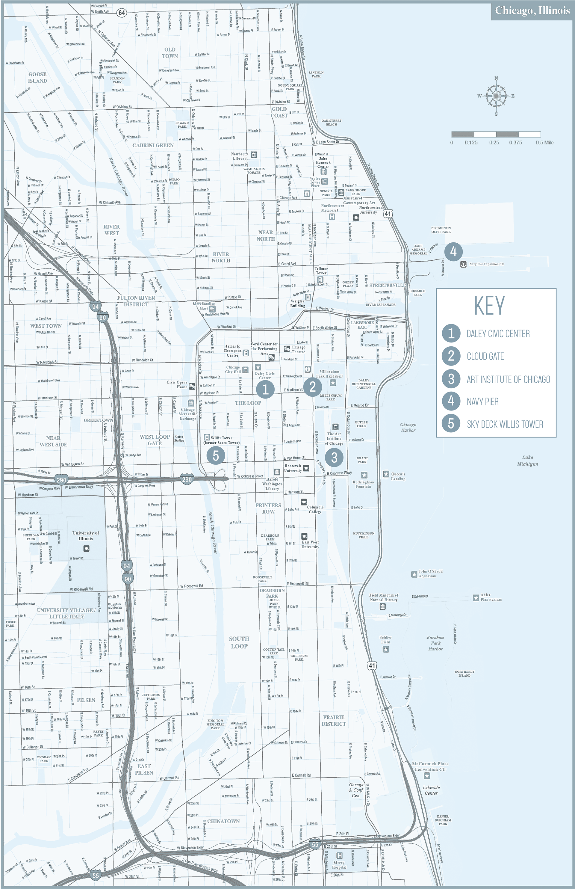
Chicago Landmarks front and back brochure with the full map when you open it.
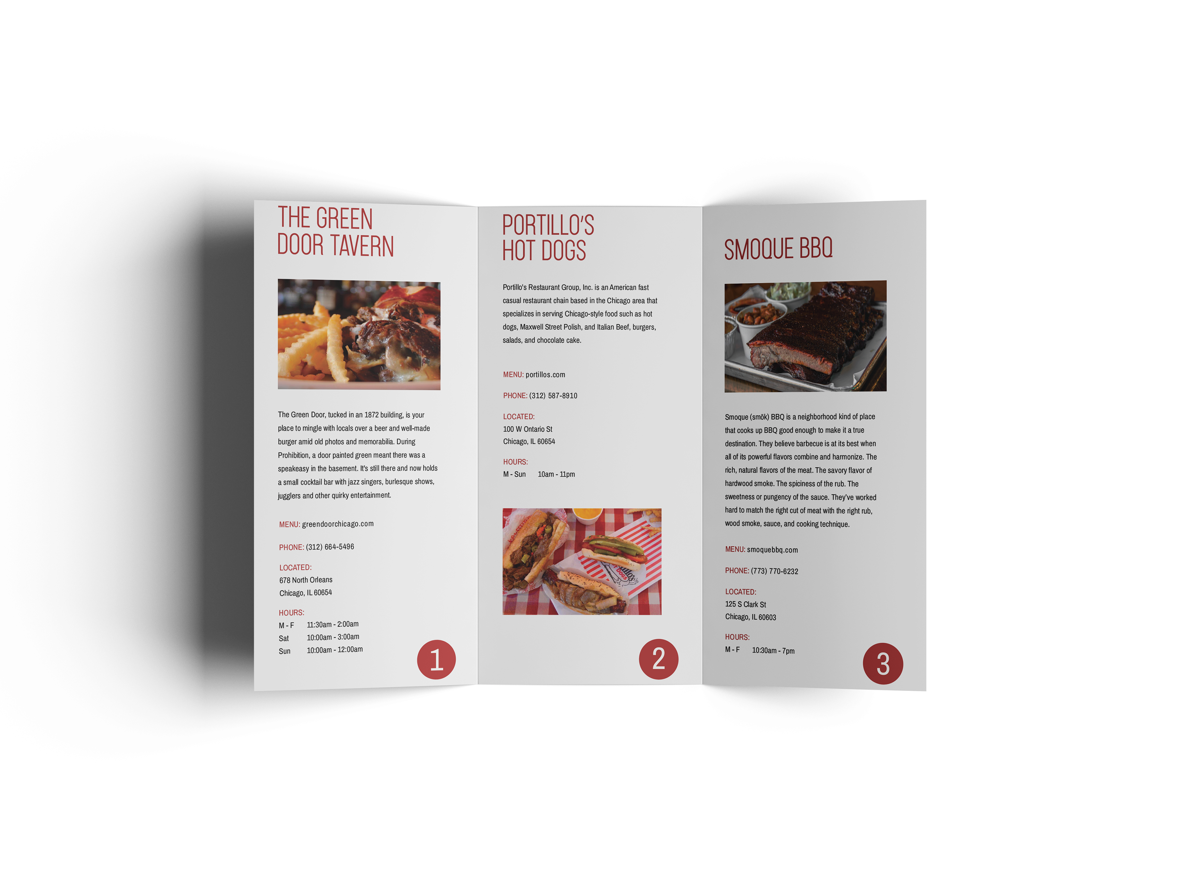
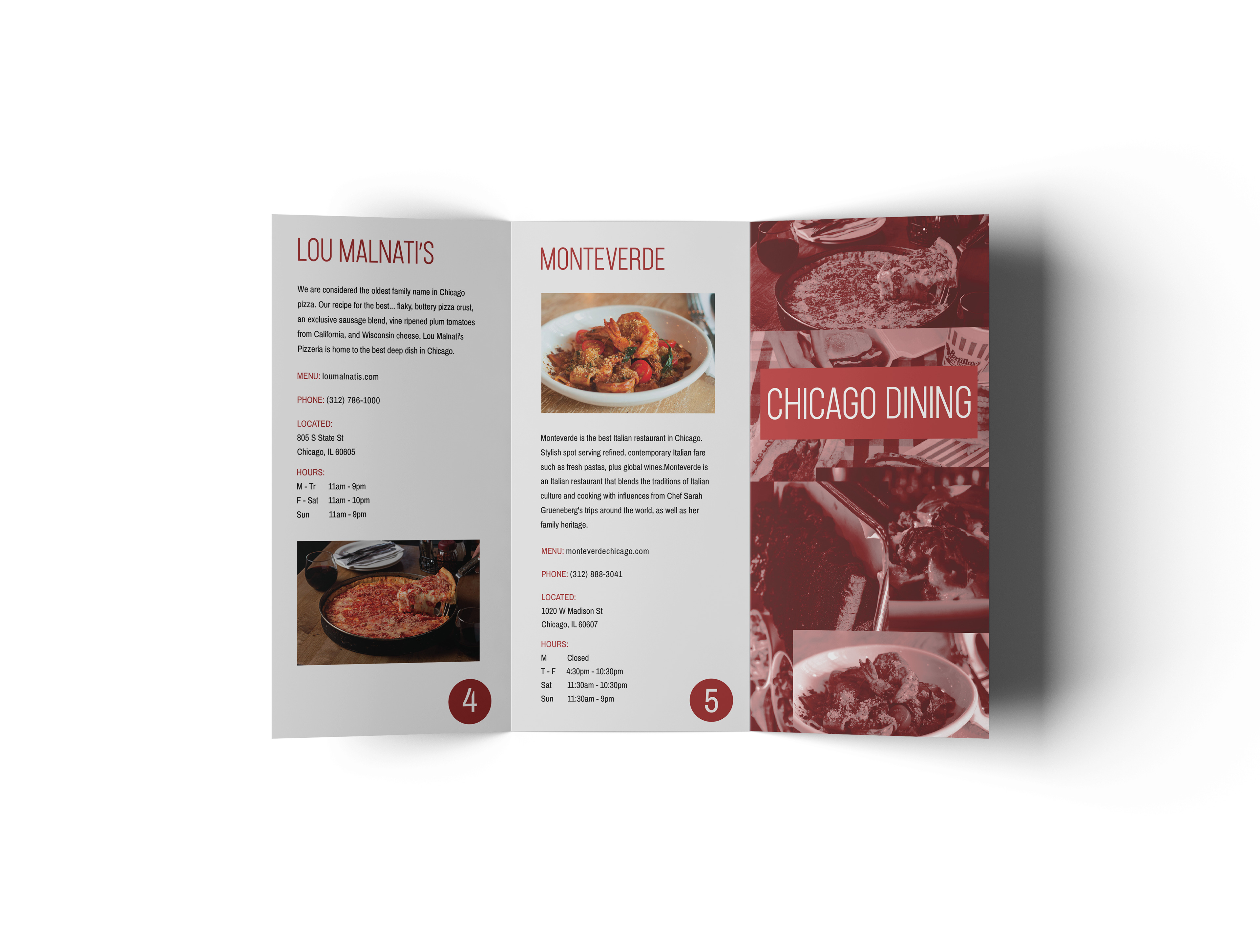
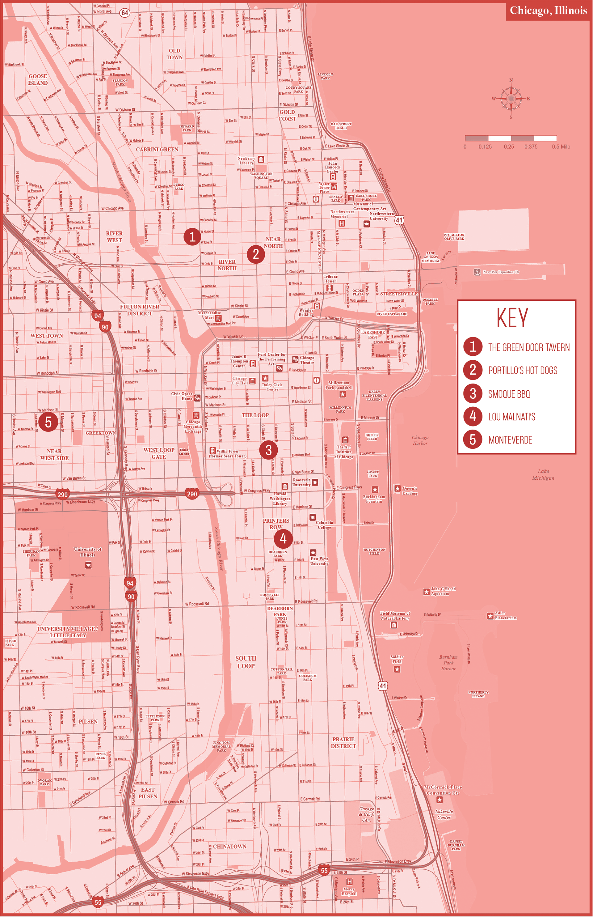
Chicago Dining front and back brochure with the full map when you open it.
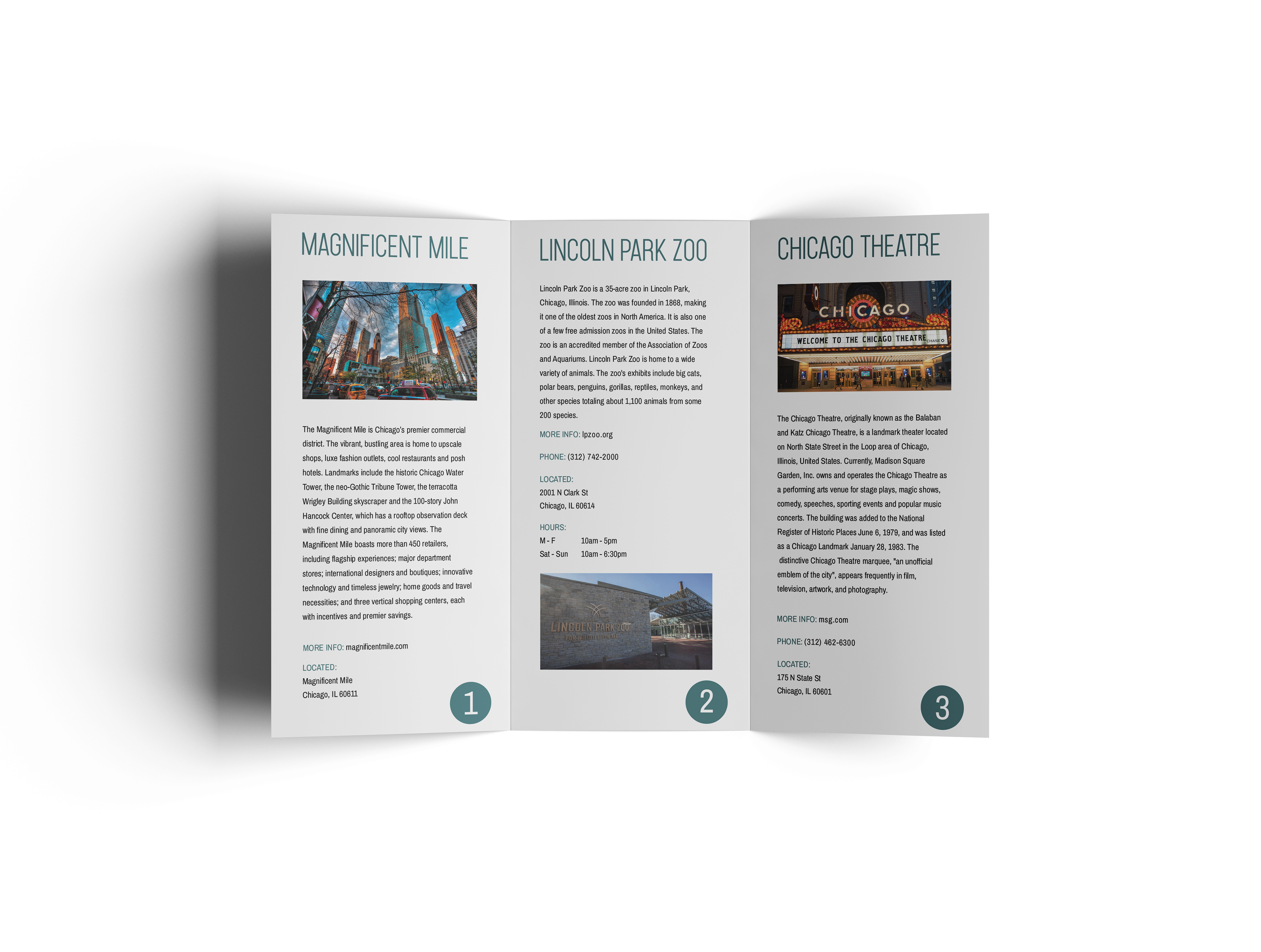
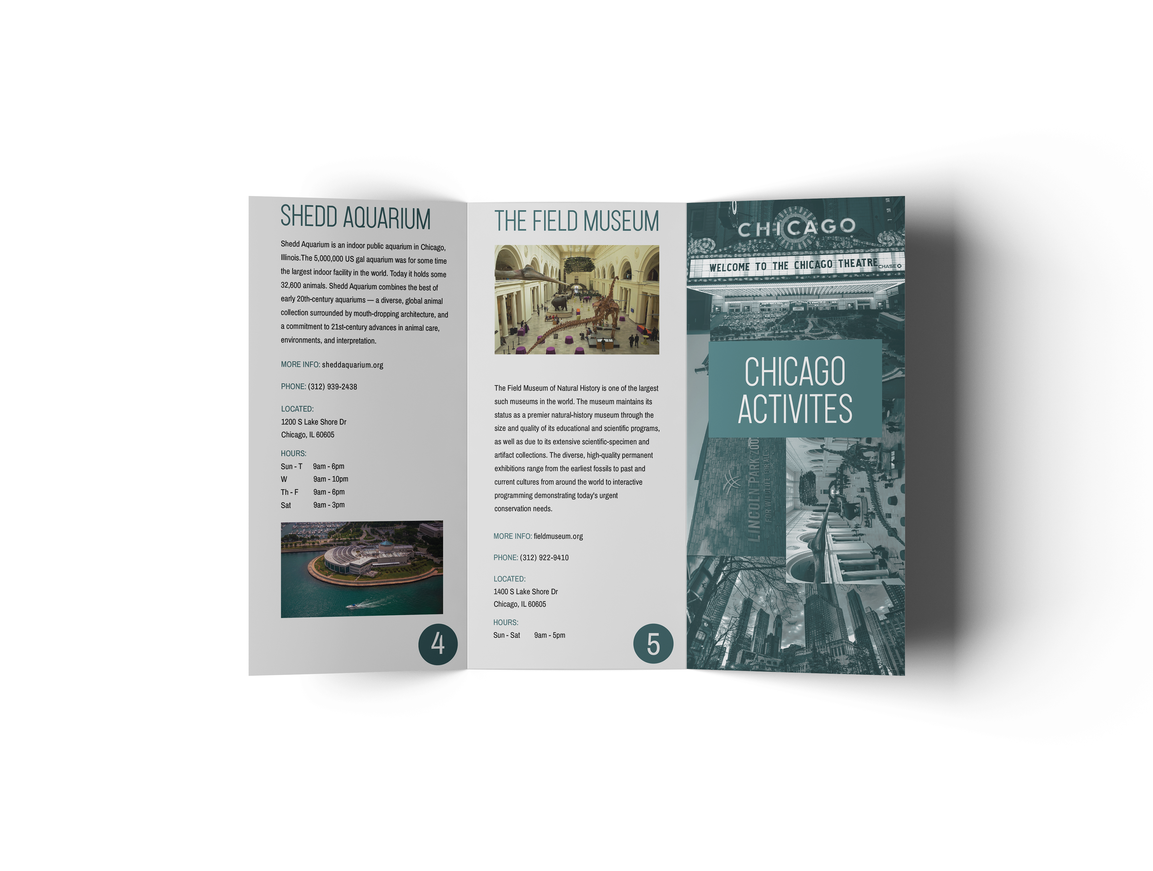
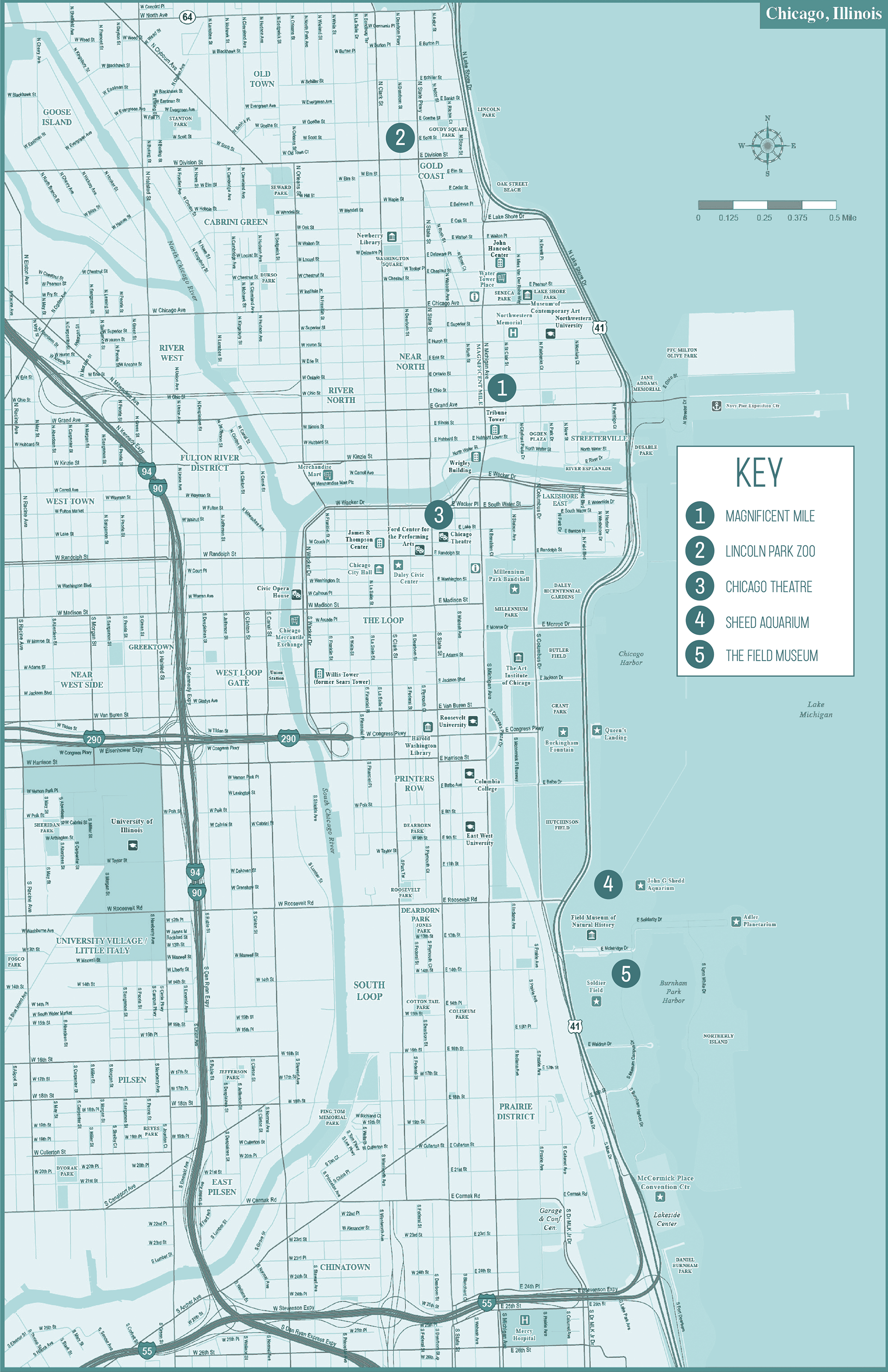
Chicago Activities front and back brochure with the full map when you open it.
Bellyband to hold all the brochures together.
I chose to do Chicago for my Guidebooks. I found all my images for the report onGoogle. I chose to keep the background of the panels of the brochures white to contrast the bold map on the back. I then added a collage of the photos included in each brochure for the cover and used a tritone to incorporate the color used on the map. I used Carson for my headline fonts and larger text because it is a taller narrow font that relates to skyscrapers and a city feel. I used Archivo Narrow for my body copy and throughout my brochures. I chose the color scheme I did from a Chicago color palette online. The scale of my brochures is 11 in by 17 in. I chose this size because I wanted to make this a nice size map and brochure. I made a bellyband to put around all three brochures.
