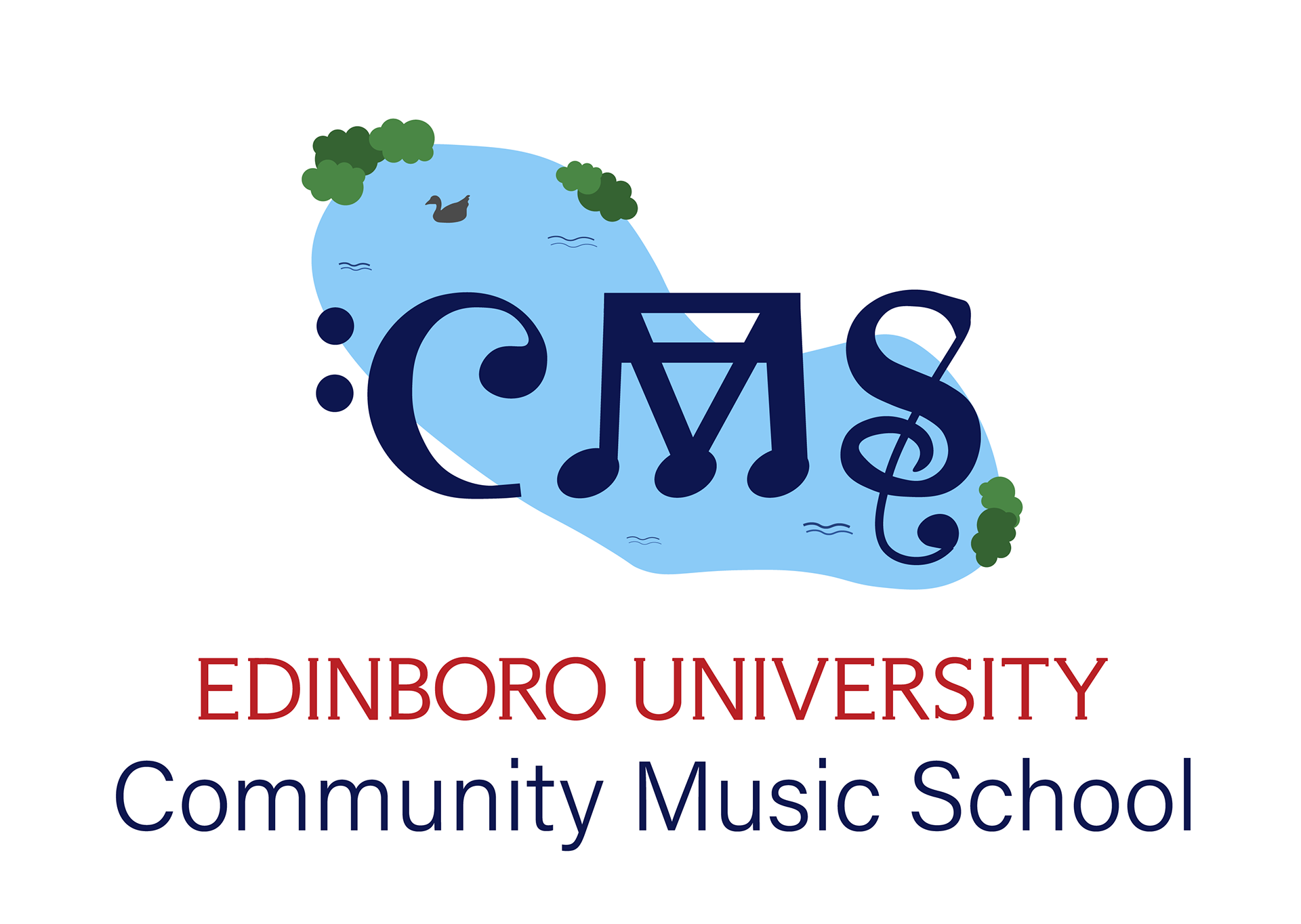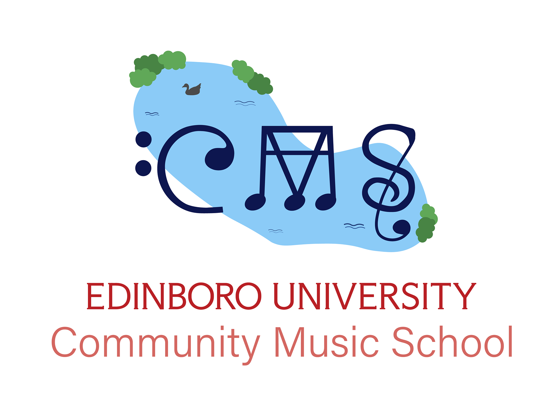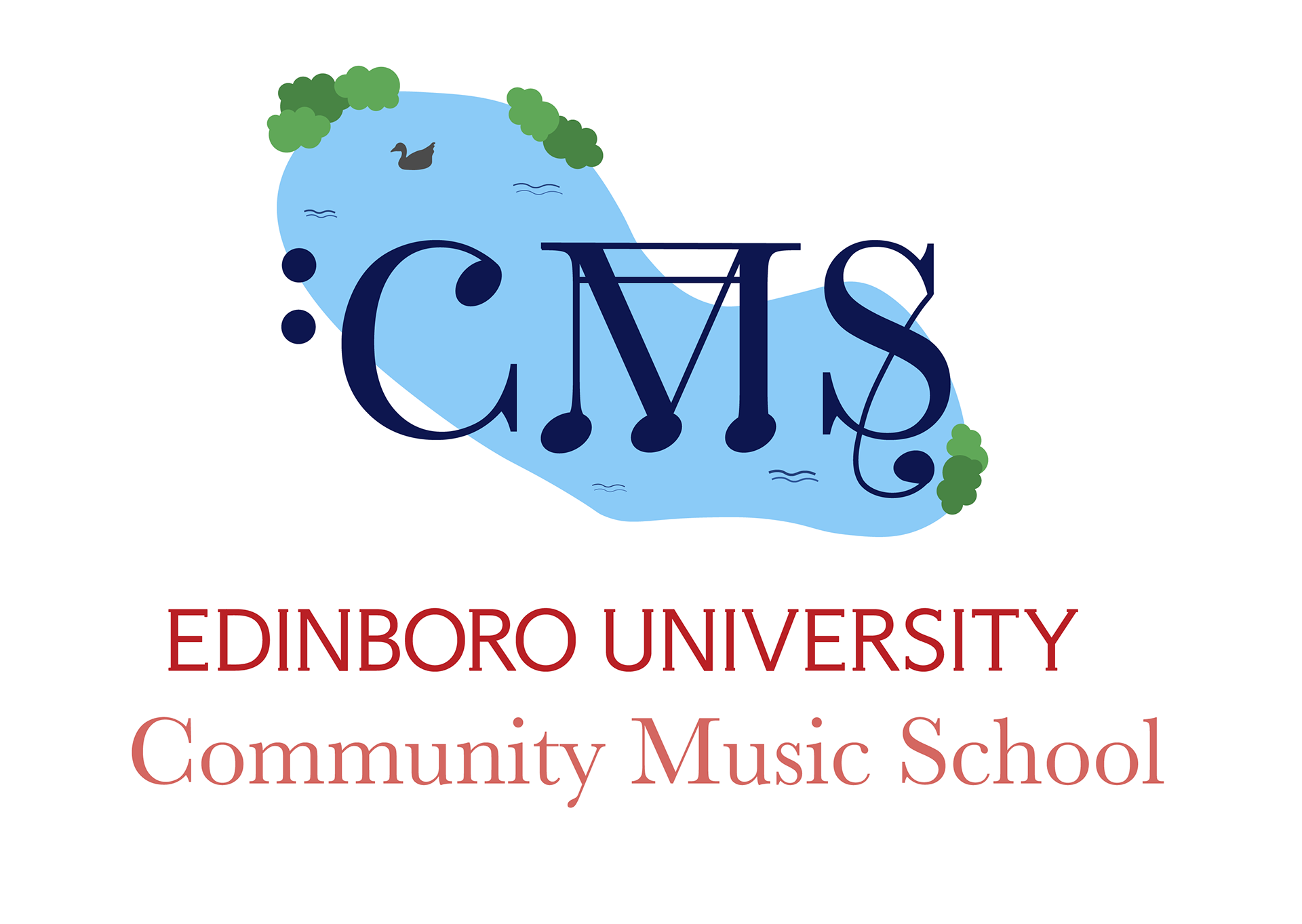


These are some variations of the Community Music School logo for Edinboro University. I wanted to use the letters C,M,S and design them in a way to relate back to the Community Music School. I chose to find music notes that mimicked the letters close enough that I could manipulate them to look like the notes were forming the CMS. I also chose to add a lake, Mallory Lake to be exact, in the background to show community. Edinboro University holds events there, students gather and spend time there, and it is in the center of our University. I added smaller ripples, a goose, and bushes around the lake to give more of a sense that it is a lake besides the body of water. I chose to make the logo red, light blue, and navy for one version and red, light blue, navy, and peach for the other two. They all have smaller secondary colors like green and grey for the elements around the lake. I also chose the font for the Community Music School to contrast the Edinboro University word mark in the first two logos and a different font to compliment the Edinboro University word mark. I want this to feel sophisticated yet still inviting.
