
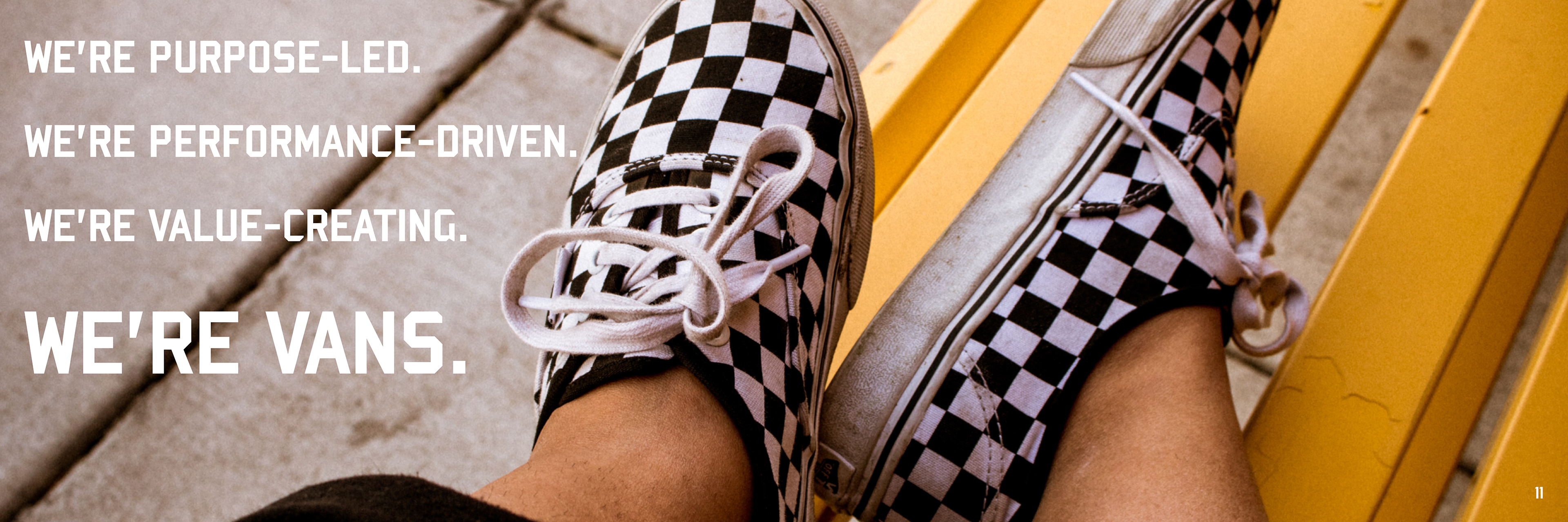
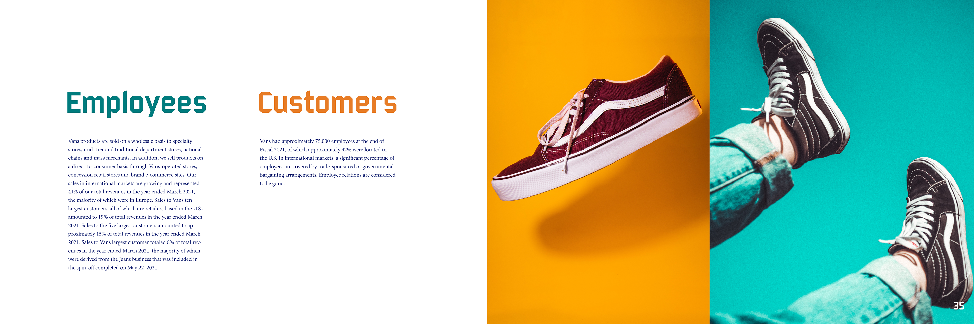
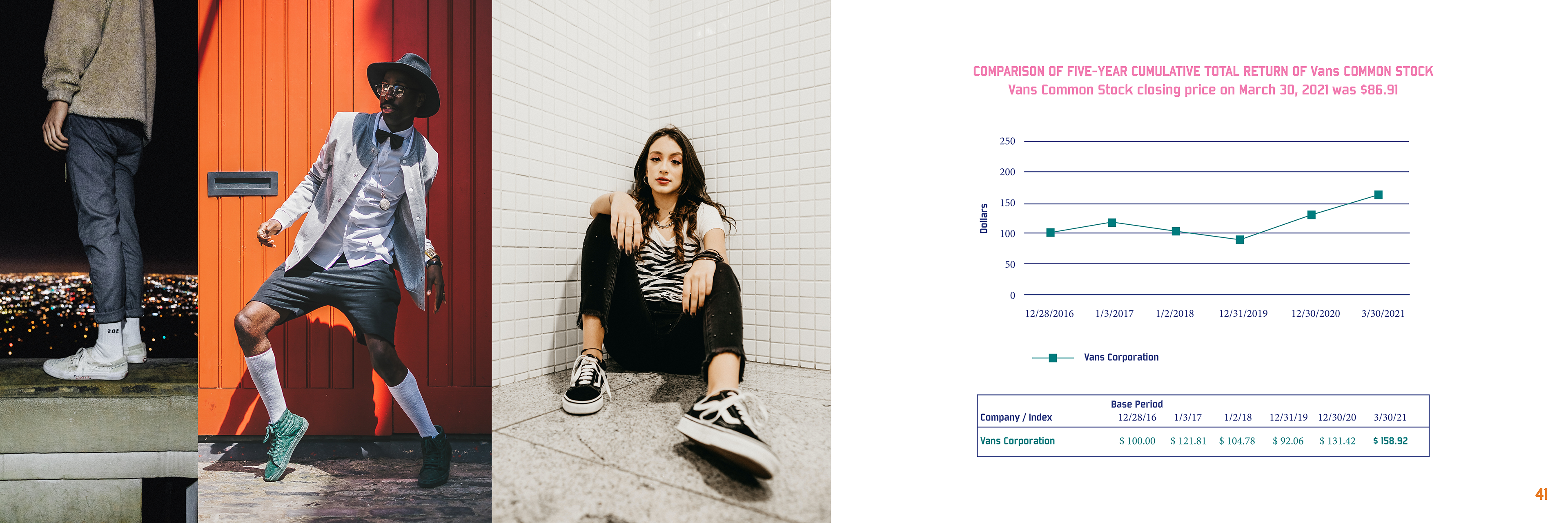
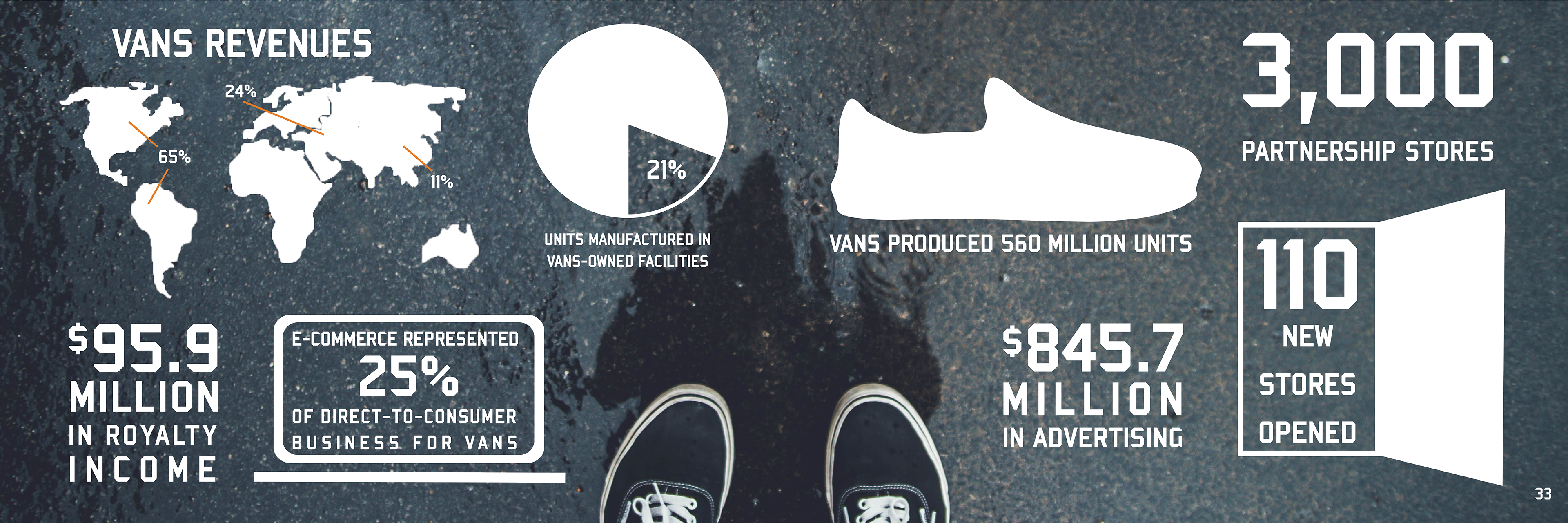
I chose to do Vans for my Annual Report. I found all my images for the report on unsplash.com. I chose to keep the background of the spreads white for more of a contemporary look. I then added a collage of different photos throughout the pages to get a bold look representing how bold the Vans brand is. I used Bombardier for my headline fonts and larger text. I used Minion Pro for my body copy and throughout my graphs. I chose the color scheme I did from a pair of Vans I found and related those colors throughout the book. The scale of my book is 12 in by 8 in and 24 in by 8 in flat. I chose this size because I wanted to make a different scale from what I have done before and I used some proportions from a Vans shoe box to get the dimensions I did for the book. I plan to do a spiral binding to relate to laces being woven on Vans and I want to cut shoe laces and add the pieces of lace on the outside of the spiral to look like the book is tied with shoe laces. I will also add a die cut on the cover so you see the checkered pattern through the “Vans” cut out on the cover. I am keeping the cover white to add to the contemporary feeling throughout the book and the checkered pattern showing through will add the bold concept I’m going for.
